6

Over on Meta Stack Exchange, I announced an experiment that would:

  • Turn on the review queue indicator whenever there's a task available in any queue.
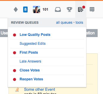
  • All queues with at least one task will be marked with a red dot. There are no grey dots:

    Inbox Zero indicator

This will mean you'll be notified of outstanding tasks you can't clear. We are aware of a problem that people will be notified of queues that they don't have the privilege to access. That's next on the list to fix. The goal is to be more aggressive with the indicator to see if we can clear tasks more quickly. Please let us know if we've gone too far.

And in general, we're interested in any feedback to this change: positive, negative or noncommittal.

5
  • 8
    Note that I asked Jon to add us to the testing group. If you hate this, your ire should be directed at me, not him!
    – terdon Mod
    Commented Dec 15, 2017 at 0:53
  • 1
    Does this have some feature that hides the red dot from the top bar icon if you touch it (open the menu) or something like that? I saw it a while ago, and then I didn't see it any more.
    – ilkkachu
    Commented Dec 15, 2017 at 16:08
  • 2
    @ilkkachu: Correct. If you click on the icon, that clears the dot for an hour. That way you aren't warned immediately after completing reviews. For more information, see How does the review-needed indicator work exactly?
    – Jon Ericson StaffMod
    Commented Dec 15, 2017 at 17:27
  • 1
    I'm probably stating the obvious, but ... There is a User Experience Stack Exchange where some experts on UX design hang out. I took some Information System classes in college and they included UX design. There are some not-so-obvious requirements, and the folks on UX.SE can probably help identify them. (I work in AppSec and study Security UX. I would be careful of desensitizing folks with indicators. I don't know if it is happening with the existing and proposed badges and icons).
    – user56041
    Commented Dec 21, 2017 at 16:55
  • @terdon: I disabled the experiment on this site for the moment. Thanks for participating.
    – Jon Ericson StaffMod
    Commented Jan 9, 2018 at 0:00

4 Answers 4

26

As in inveterate queue clearer, the behavioural impact is negligible. The cognitive impact, however, is unwelcome. The red dot immediately signals dread: "Oh, there are a heap of these things to deal with now..."

Save the red for when you really need it (ie., when the queue really is backed up: 10 or more, or whatever the old threshold was). Bring back the grey so the site feels less like it is on fire all the time.

8
  • 4
    Really? I found it had the opposite effect on me. Since our queues are rarely long (thanks to the efforts of people like yourself), the new UI made me ignore them because it never looked like there was anything to do. Now I immediately notice when there are pending items in the queue.
    – terdon Mod
    Commented Dec 15, 2017 at 11:35
  • 5
    As a regular reviewer, I'm with Jason: don't cry wolf. A single "first posts" review queue item is not worth a red alert. I've only seen one reviewing emergency in my few years here -- the result of a developer "oops", not a lack of reviewing.
    – Jeff Schaller Mod
    Commented Dec 15, 2017 at 15:58
  • In the default system, thresholds are dynamic. I've been adjusting them based on a few rules every week or so. Thanks for the feedback. We'll probably let this run for a week or two before reverting to the previous system. We're still trying things out. ;-)
    – Jon Ericson StaffMod
    Commented Dec 15, 2017 at 17:45
  • @terdon I think it is precisely because our queues are generally manageable that the change is unwelcome. I have gone from feeling like contributing is manageable within micro slots across the day to, "OMG: do it NOW!" :)
    – jasonwryan
    Commented Dec 15, 2017 at 17:46
  • 1
    How about a green pip on the icon when there are a few things in the hopper, and a red one when a queue happens to get so long as to be considered troublingly so?
    – DopeGhoti
    Commented Dec 15, 2017 at 22:52
  • 1
    @DopeGhoti I've no objection to that, but I don't consider it an improvement over the grey indicator that we have been living with since the major header rewrite.
    – jasonwryan
    Commented Dec 15, 2017 at 23:17
  • Part of a problem with a grey indicator, I suspect, is that it gets lost in the "noise" of the other grey icons and fails to draw any attention. Green would (to me at least) imply "something to do but not Sev0 Important", while red implies a request for immediate attention. An alternative to a "pip" overlay would be simply colorizing the entire icon.
    – DopeGhoti
    Commented Dec 18, 2017 at 16:46
  • @terdon I agree, but then maybe the dot should be green? Meaning "you can enter here, there's space for your reviews!".
    – Nemo
    Commented Dec 29, 2017 at 12:03
8

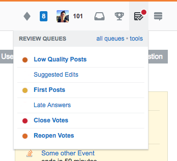
I definitely agree the review queue indicator needs to be more aggressive, but it's neither a good idea nor necessary to sacrifice the urgency indication feature just for that. Instead of setting the whole site on fire, how about a yellow-to-red transition?

first version

One could even think about always having a dot on every queue, maybe green for empty ones – those traffic light colors are quite unambiguous.1

second version

Of course the color of the review button dot should always match the darkest yellow/red, and there should be no dot only if every queue is green.

1: “Red” meaning „Stop! Don't add any questions to this queue before you did your review duty!“ ;-)

7
  • My thought exactly: if users have just been taught to take the red dot as a sort of an alarm indicator, then having it light up from the first item in the queue is somewhat odd. And people will learn to ignore it since it's always on anyway. The traffic lights would be much better, and I would have suggested that myself. Though I wouldn't mind a nonintrusive indicator for the "more than zero items in the queue" case. A gray dot on the gray icon, perhaps?
    – ilkkachu
    Commented Dec 15, 2017 at 17:14
  • I think this is not so far removed from the current default system. The main difference is that you suggest making the top bar indicator match the highest state of alarm.
    – Jon Ericson StaffMod
    Commented Dec 15, 2017 at 17:41
  • @JonEricson Not quite sure what you're saying – does a change need to be all-embracing to be a good one?
    – dessert
    Commented Dec 15, 2017 at 17:51
  • I think Jon's just pointing out that this is almost what is already there. Since this post is about the current "experiment", it might not be the best place to discuss changes to the existing system. Also, note that these colors are very hard for color blind people.
    – terdon Mod
    Commented Dec 15, 2017 at 17:56
  • Sorry about that. I was mostly trying to make sure I understood your proposal. We're definitely in the tweaking stage. ;-)
    – Jon Ericson StaffMod
    Commented Dec 15, 2017 at 18:00
  • 7
    I like this recommendation, but not with green circles. Leaving out the green circles is much more visually unambiguous, and nicer to colorblind people.
    – Wildcard
    Commented Dec 15, 2017 at 22:13
  • I agree with Wildcard. I would find green acceptable only if it were really really pale (possibly with a hint of blue; i.e., cyan), or if it were a green ring (i.e., a circle with a green border and a white interior).   And, if you’re going to use yellow and orange, use yellow and orange, not light muddy brown and dark muddy brown.   (There should be a sharp, clearly visible gradient of darkness; i.e., it should be visible even if viewed on a black&white display.)   I’m not colorblind, but even I have some trouble distinguishing between the colors in the example images. Commented Mar 20, 2018 at 21:33
4

Spoken about review queues, please change/repair the mobile apps so it's finally possible to do those tasks from within the app . I rarely use the website and thus rarely perform review tasks. An indicator no matter how big it is helps in this situation. The same goes for participation in elections, the winterbash and more stuff like that.

2

Because I was curious, I clicked through to the SEDE query to see what U&L's "N" value would be for turning the indicator red.

Re-quoting the meta post:

Each queue may be in one of three states:

  • No dot (empty queue)
  • Grey dot (at least one but fewer than N review tasks)
  • Red dot (N or more review tasks)

And as of today, U&L values are:

Name                90% of hourly samples less than this many tasks
Close Votes         4
First Post          1
Low Quality Posts   1
Late Answer         0
Reopen Vote         0
Suggested Edit      0

I'm not sure how the math would turn out for grey or red.

Given the low number of average items in the U&L queue, I'd prefer a grey dot for any non-zero queue (at any time), and a red dot for ... numbers substantially higher than the above.

My personal suggestion for red-dot levels would be:

Close Votes         10+
First Post          10+
Low Quality Posts   10+
Late Answer         5+
Reopen Vote         5+
Suggested Edit      10+

You must log in to answer this question.

Not the answer you're looking for? Browse other questions tagged .