19

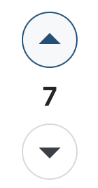
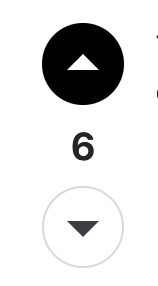
I think the usability on the voting buttons has gone down since the new round buttons were put in place.

I went to upvote a question today and was told I'd already done so. Looking again it's clear there's a difference between the buttons. But that first glance, to someone not so familiar with the site layout, could use some work IMO.

Compare this:

screenshot of the offending buttons

with the same UI on Meta, where it's immediately obvious a vote has been cast.

screenshot of a more obvious button

I don't think it needs to go that far, but lightly filling in the circle would be an improvement.

Not tagging this because it's a subjective thing, maybe I'm wrong. 🤷🏻‍♂️

Not sure how much leeway the sites have with the new design rules either.

1 Answer 1

5

This was discussed on the stackexchange meta, and it was generally agreed that the new design is less accessible, due to low contrast among other reasons. However, the design will stay this way, apparently.

However, you can use a user stylesheet to revert it back: https://meta.stackexchange.com/a/389568/655681

3
  • 1
    I probably haven’t noticed it as much because I spend most of my time on SO where I’m still using the Frisa Lank skin from April Fool’s 2022 lol. But other sites’ colours seem better for contrast than UL
    – miken32
    Commented Aug 12, 2023 at 13:58
  • 2
    And also I shouldn’t be surprised this was already brought up on mse but again I think this site’s colours make it more noticeable than others
    – miken32
    Commented Aug 12, 2023 at 14:00
  • 1
    I remember that discussion, but I don't remember that the design with high contrast was for meta sites, while the main sides stick to the pale design.
    – Philippos
    Commented Aug 14, 2023 at 11:50

You must log in to answer this question.

Not the answer you're looking for? Browse other questions tagged .